Insights+
Introduction
Device42 Insights+ provides integrated analytics that leverage the breadth and depth of Device42 discovery to help you make sense of your data through visuals and dashboards so that you can make better, more informed business decisions quickly.
Insights+ identifies patterns, trends, and outliers in data sets across your entire estate, elevating your performance with data understanding.
The combination of automatic discovered data and visualization empowers you and your IT teams with a more accurate understanding of your environment that would take the most senior IT staff years to understand – which helps reduce the time it takes to restore service, increase the speed of root cause discovery, and better plan for capacity growth.
Additional curated dashboards are available on our Insights+ GitHub page: https://github.com/device42/insights. Follow the instructions on the page to download and import the dashboards.
Using Insights+
Click on Insights+ in the Device42 main menu to display the Insights+ home page, and then select the visualizations you want to see.
Note: You can also select and display Insights+ dashboards on the Device42 home page.
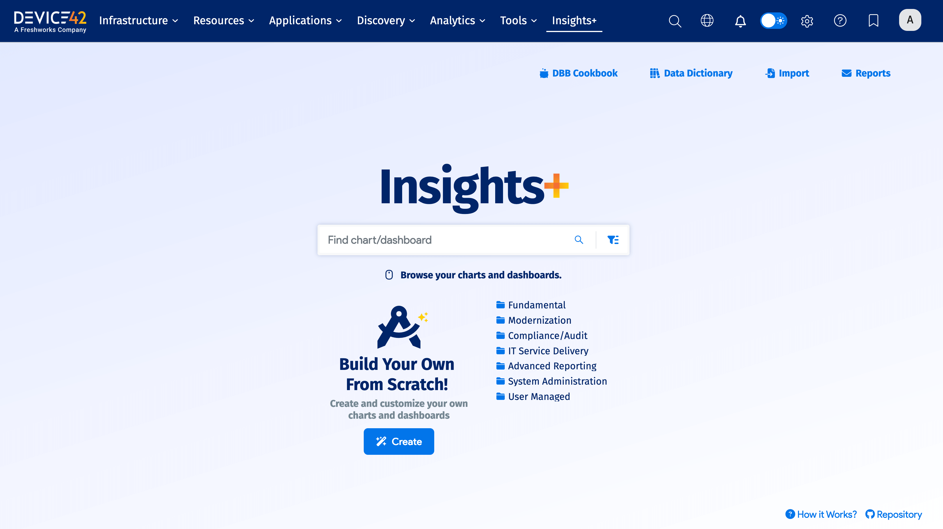
- Click DBB Cookbook to go to the cookbook documentation pages.
- Click Data Dictionary to see the available Data Building Blocks.
- Click Import to get new or updated dashboards as they become available. (Note you must be a super admin user or have the Feature | Update Insights+ Dashboards permission to import.)
- Click Reports to create or edit email Reports and Alerts.
- Click How it Works? to view the Insights+ documentation page.
- Click Repository to go to the Insights+ GitHub page.
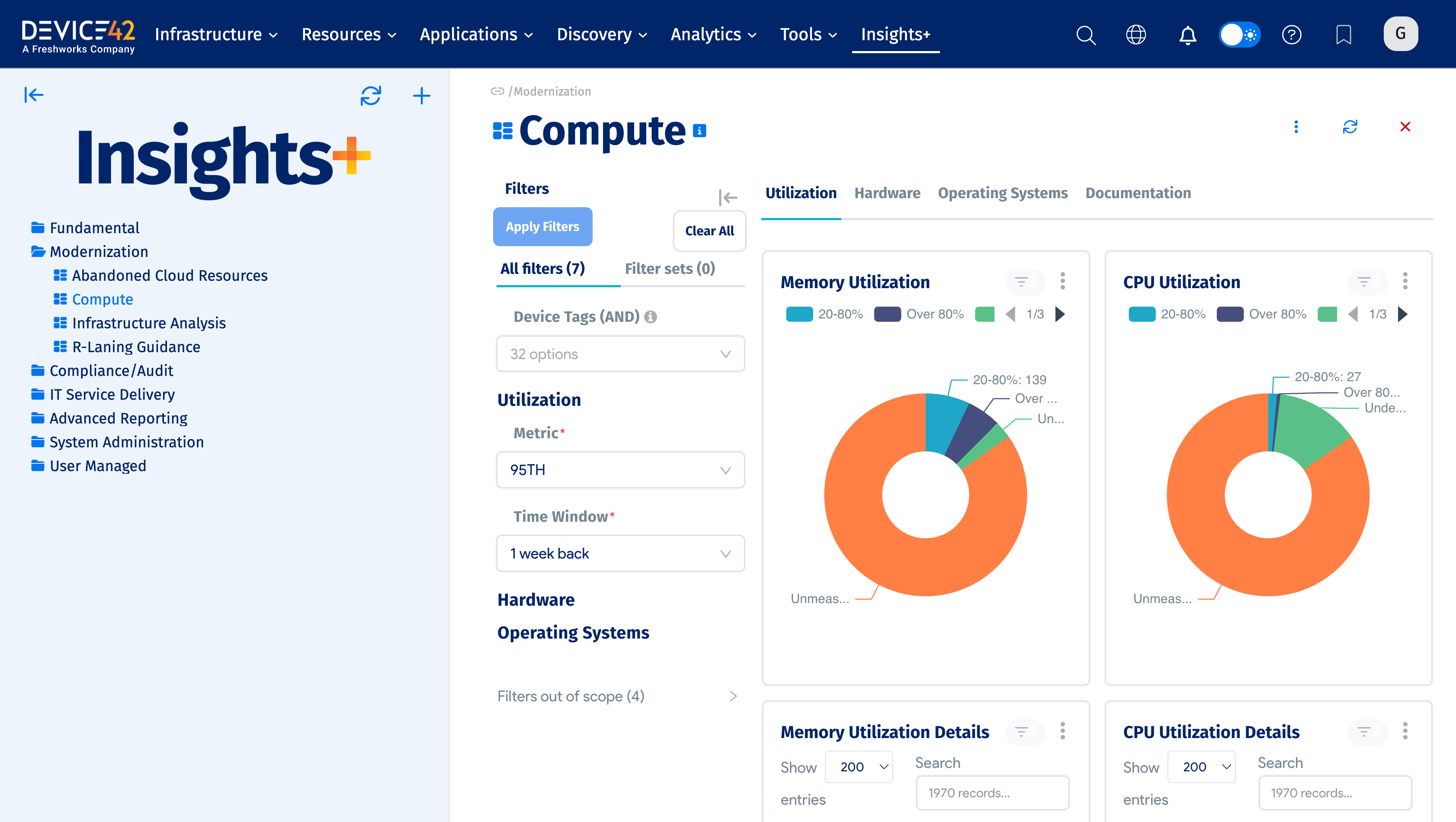
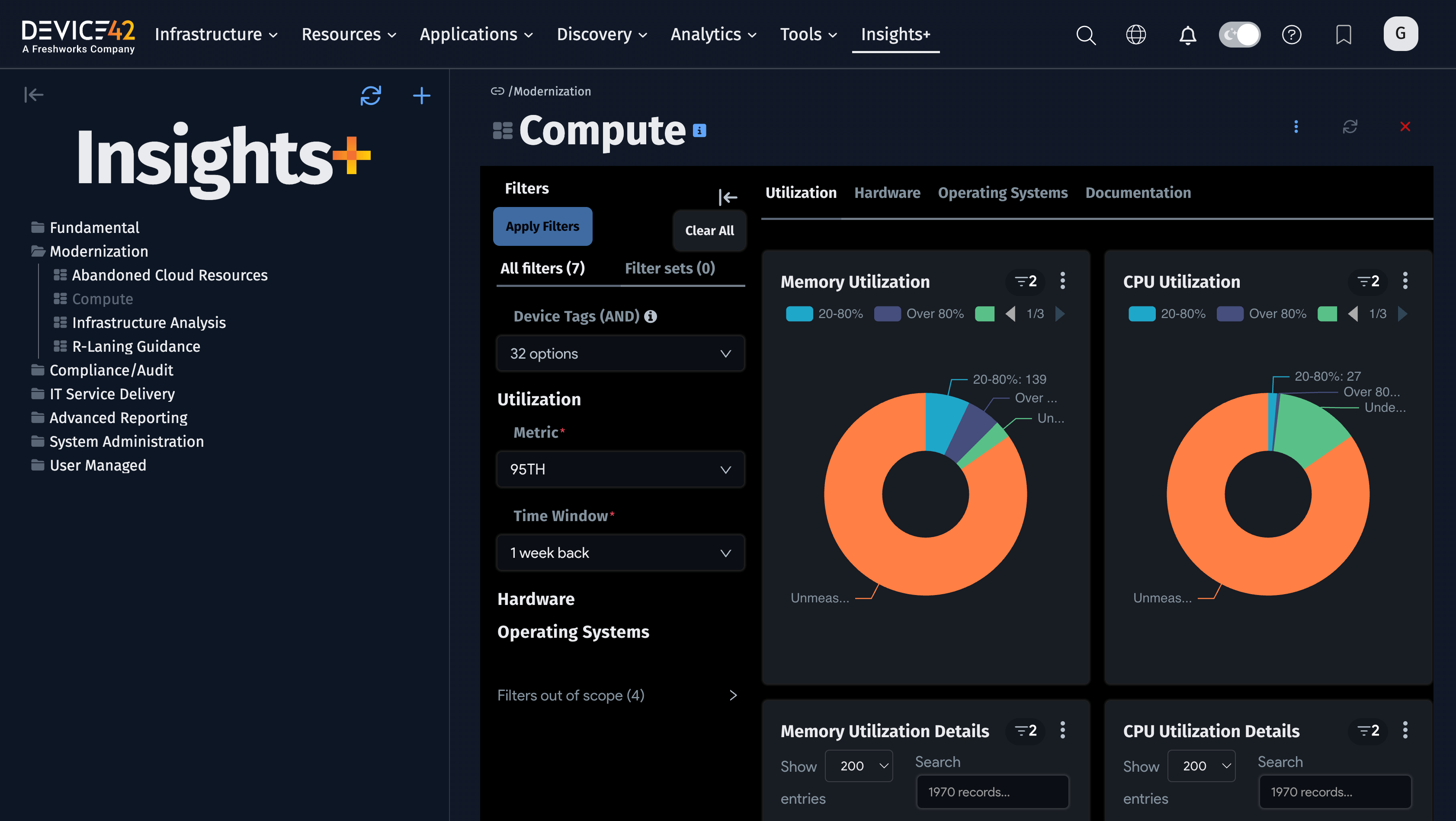
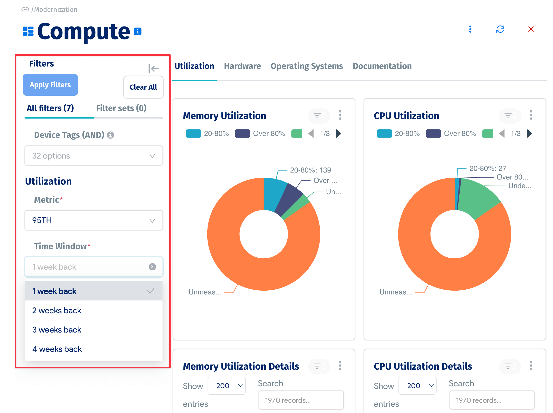
- Click on a dashboard to see its charts and graphs. The list of dashboards and charts appears in the left panel.
-
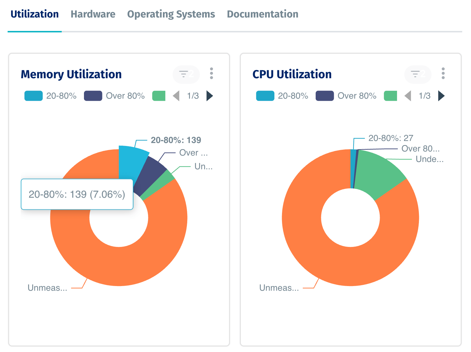
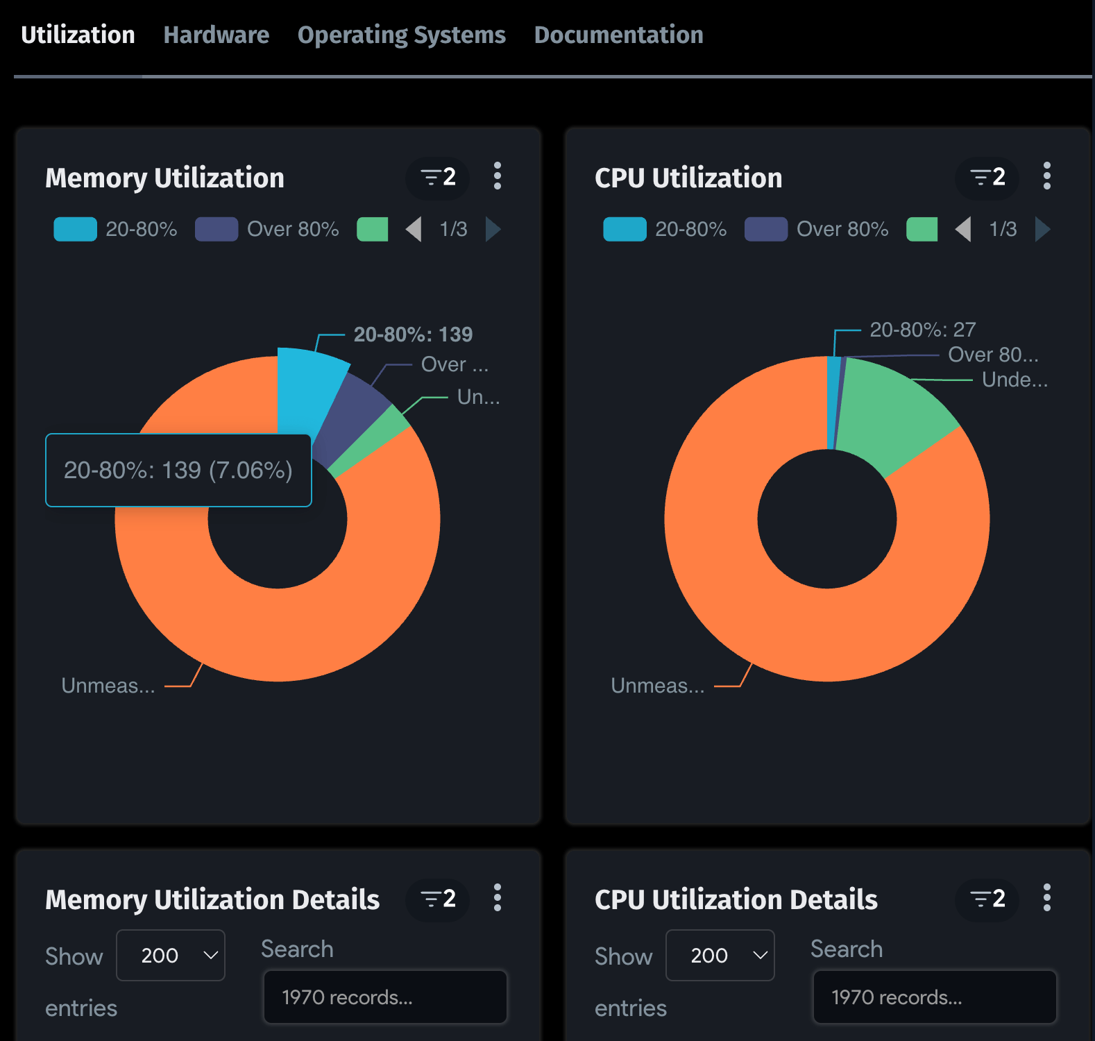
Hover over elements in a chart or graphic to see the tooltip breakdown of its values.
-
Many Insights+ dashboards include filters you can use to refine the visualizations to see the information you want. You can collapse the filters to increase the dashboard viewing area.
-
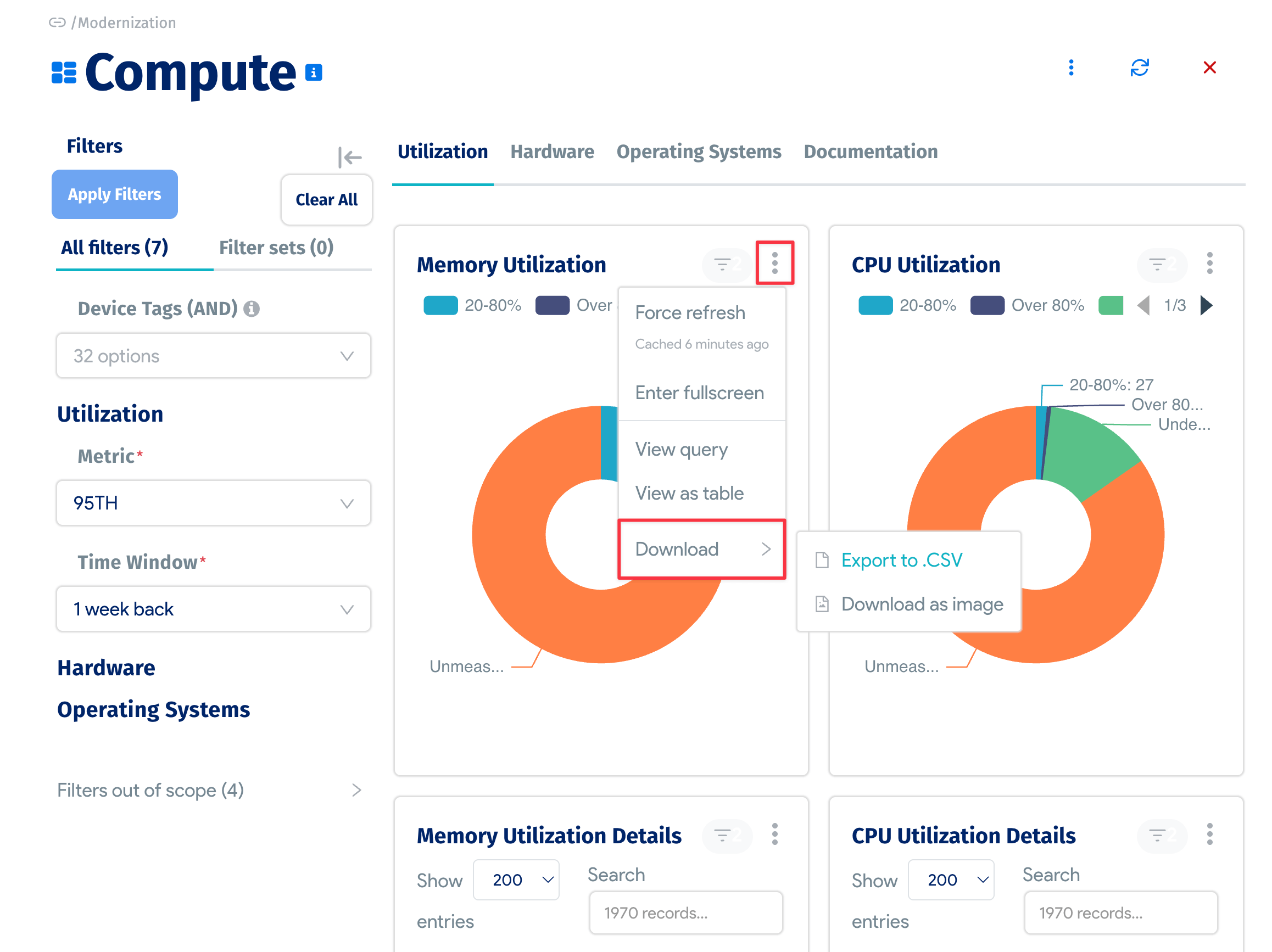
You can also refresh or maximize a chart, view the chart query, view it as a table, or download it as an image or CSV file.
Terminology
Before diving into Insights+, there are some key terms to go over.
Dataset
Datasets are the smallest building block within Insights+. This term refers to the result of a query to the Device42 database. It includes the defining SQL query, resulting columns and data types, as well as metrics and calculated columns (defined below).
Metric:
A metric is an aggregation defined on top of a dataset. For example, in a query that returns one record per physical device, a metric could be the count of records returned – the total number of physical devices. Available aggregations include Count, Sum, Avg, Max, and Min.
Calculated Column:
A calculated column is similar to a metric in that it is defined on top of a dataset. The difference is that it is not limited to aggregations. It is defined by a SQL expression and acts like any of the columns defined in the results of the dataset.
Chart:
A chart is a visual representation of a singular dataset. While a dataset can be shared by multiple charts, one chart can only use one dataset.
Dashboard:
A dashboard is a collection of charts that share a common theme. These charts can share underlying datasets or use several different ones. Dashboards can also include filters that apply to charts contained within them, as well as tabs to help organize the visualizations into relevant categories.
System-Defined:
Any dataset, chart, or dashboard provided within Device42 is considered to be system-defined. This means that users of Insights+ cannot delete or otherwise modify these objects.
Tags:
Tags within Insights+ are much like tags throughout Device42 – brief descriptions of the object they are attached to. They can be used for searching and filtering for specific visualizations.
Dashboard Hierarchy
Upon opening Insights+, the landing page shows the hierarchy of existing dashboards and charts. Each system-defined dashboard in this list comes with a brief description and a set of tags. These can be viewed through the info bubble next to their name. Dashboards also have a clickable arrow to display the list of charts that exist on it.
Clicking on any individual chart or dashboard will pull it up front and center while moving the hierarchy over to a navigation pane on the left. The sidebar can be hidden by selecting the arrow in the top-left corner of the page, and the dashboard hierarchy can be reloaded using the refresh button next to it.
Search and Filter
On the landing page of Insights+ there is a search bar. It searches through existing charts and dashboards and opens a new page with the descriptions and tags more visible to ensure the requested information is clear. Within the search bar is a filter option – searches can be restricted by content type (System-Defined or Custom) and by tag. The tag search returns any chart or dashboard that contains at least one of the tags selected.
Import and Export
There are several dashboards Device42 has developed that are not loaded into the application automatically. These dashboards are located in the Insights+ GitHub repository. It is also possible that members of the Device42 team have developed out-of-band dashboards specific to a use case that need to be loaded in. For that, the import functionality allows a user to pull other content into the application.
On the Insights+ home page, there is an Import button in the top right-hand corner. It opens a pop-up that expects a .zip file which defines a chart or dashboard.
Importing a dashboard that already exists will overwrite any existing content or changes. It is also important to note that system-defined dashboards cannot be imported or overwritten. The user who imports a dashboard or chart is considered the owner – they alone are able to make changes or re-import (and overwrite) it. The list of owners can be modified.
Exporting currently supports the download of a JPG image of the dashboard or chart being viewed.
Insight+ Videos
Instructional videos for using Insights+.
Standard Reports
You can use Insights+ to create a chart from existing Standard Reports (formerly known as 'Classic Reports').
Email Reports and Alerts
You can create and edit email reports and alerts for dashboards or charts that are generated and sent based on a schedule you set for each report or alert. The reports and alerts contain images of the dashboard or chart, along with links to them in Device42.
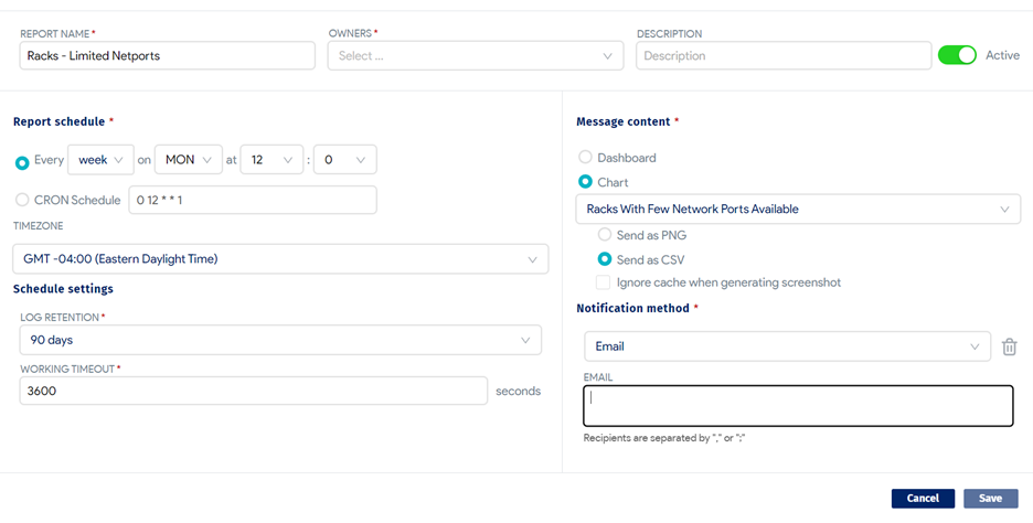
- Report content can be either a dashboard or a chart, and the report is triggered according to the schedule you set up for the report.
- Alert content can also be either a dashboard or a chart, but an alert is based on a condition you define for the alert using a SQL query that runs against a Device42 database (
d42_viewer_mt). The condition check is triggered according to the schedule you set up for the alert - Alerts and reports run as the alert or report creator, so they respect the model or RBAC permissions of the user who creates the report.
- Alerts and reports can have multiple owners (including the creator) who can all modify the alert or report.
- Alerts and reports use the Device42 mail server settings (Tools > Settings > Mail Server Settings) to send alert and report emails – these need to be set for emails to function correctly.
Click Reports at the top right of the Insights+ home page, a dashboard, or a chart to display the Alerts and Reports page.
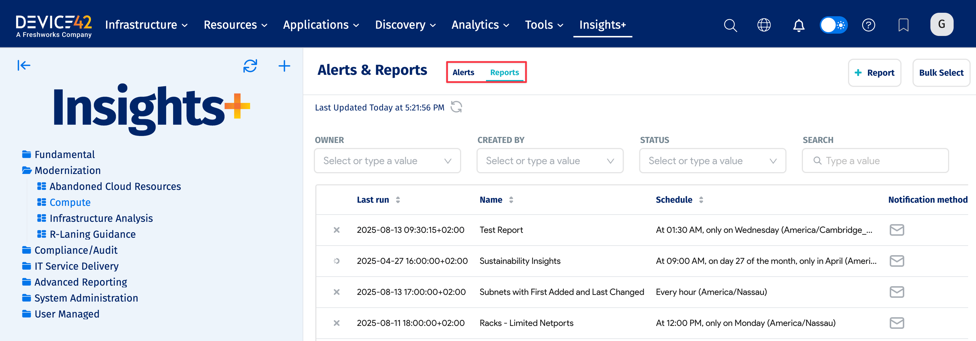
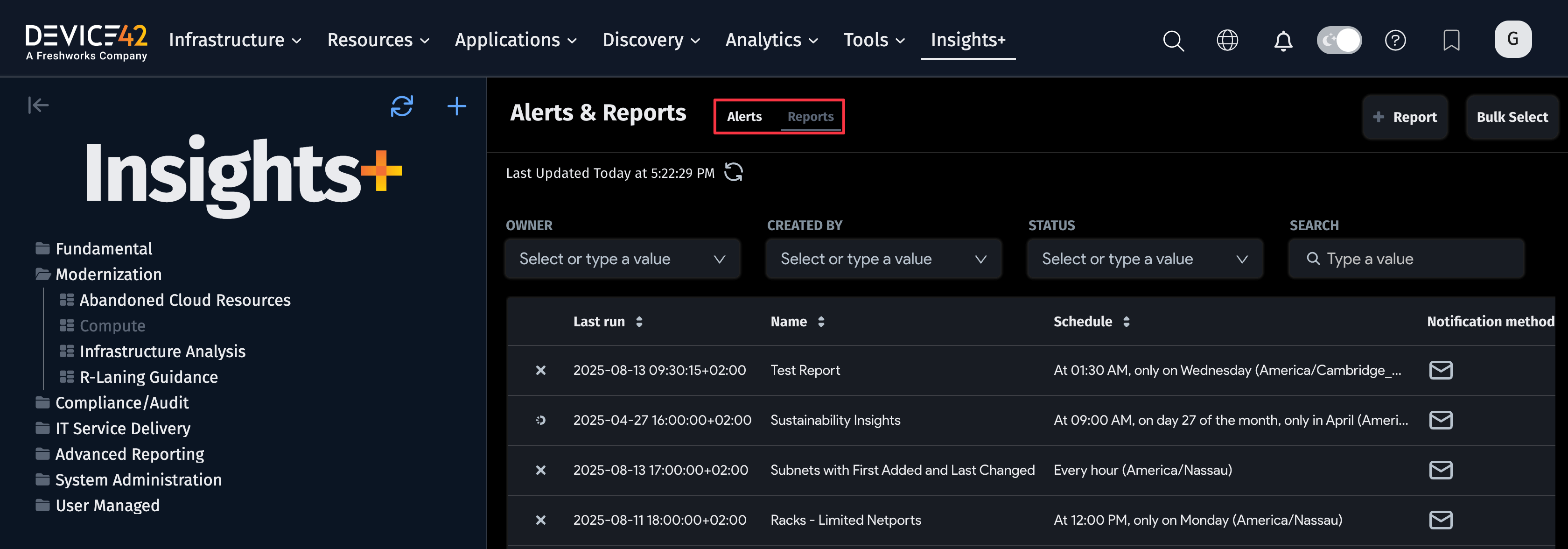
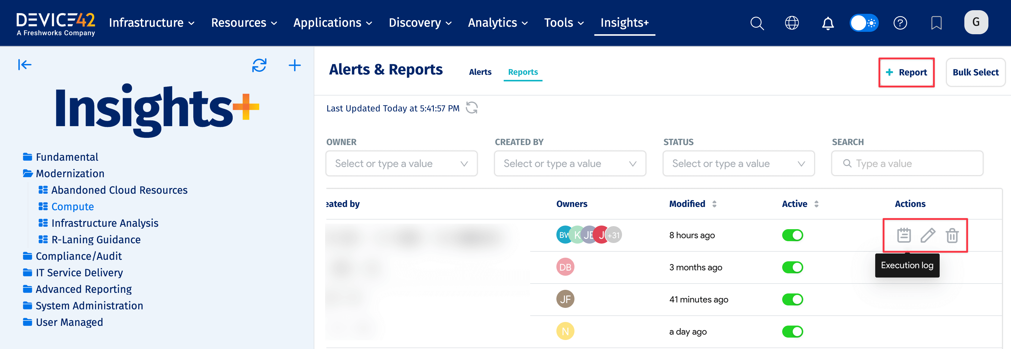
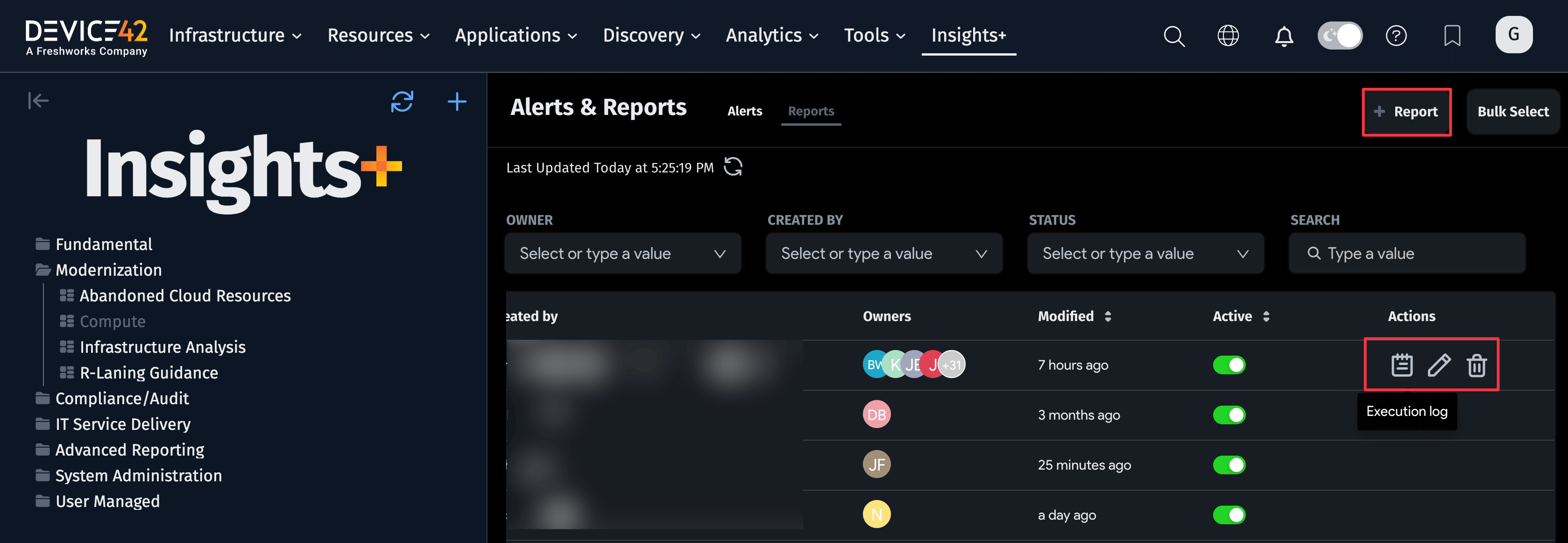
The list page displays existing reports or alerts and includes Actions options for viewing logs and editing or deleting the reports or alerts. Click Alerts or Reports at the top left to display the items you want.
Reports
Click + Report to add a new report, and click the Edit icon to edit an existing report. Insights+ displays the add/edit page.
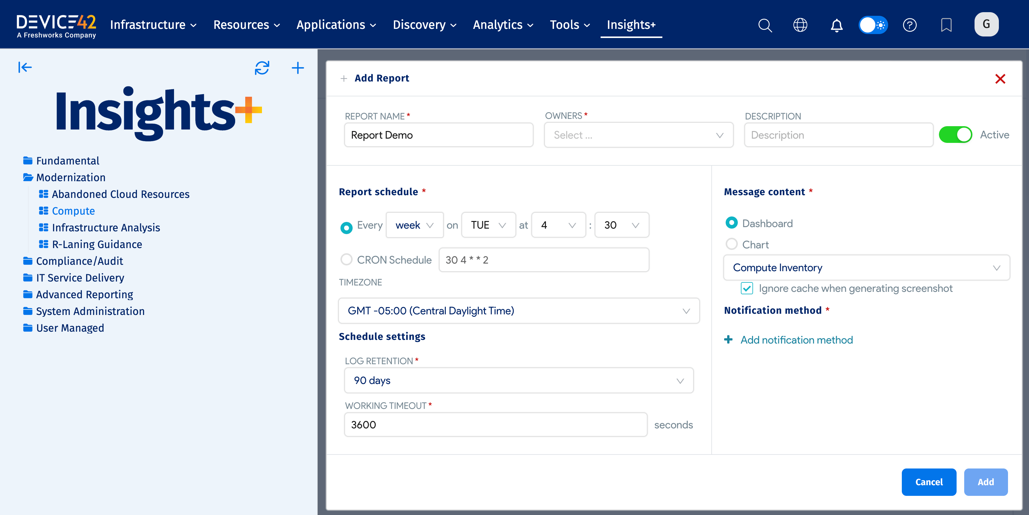
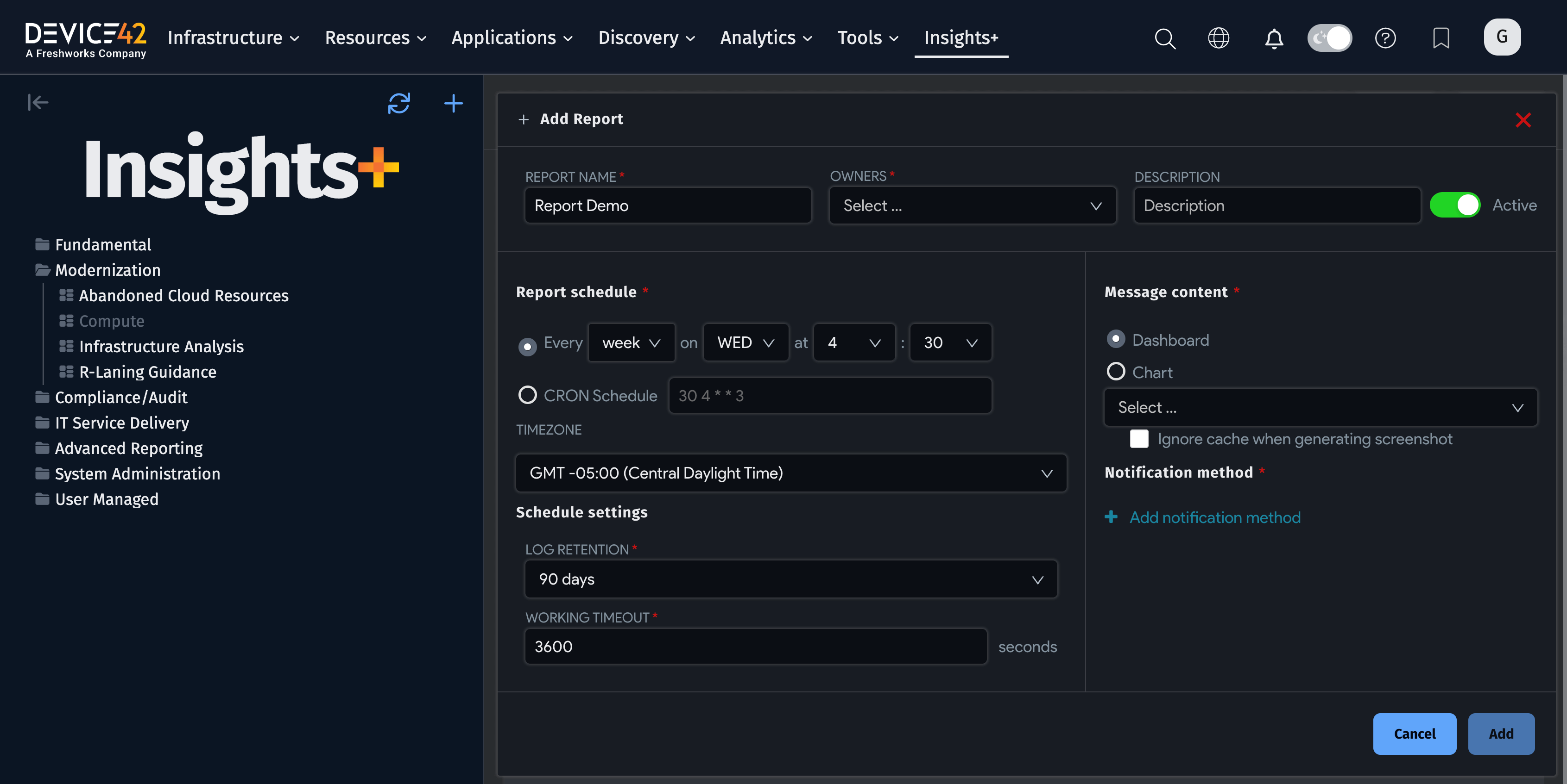
- Enter a Name for the report, select the report Owners and add a Description if you want to. Note that Owners should include the report creator and any other users you want to be able to modify the report.
- The report is Active by default.
- Use the Report schedule dropdowns to set the schedule or enter a CRON Schedule.
- You can select or enter Schedule settings for Log Retention and Working Timeout.
- Select either Dashboard or Chart as the Message content and then use the dropdown to select the specific dashboard or chart you want. Select Ignore cache when generating screen shot to have Insights+ regenerate the dashboard or chart graphic rather than using a cached version.
- Select Email as the Notification method, and then enter the recipient email addresses (separated by commas or semicolons).
- Click Save to save the report.
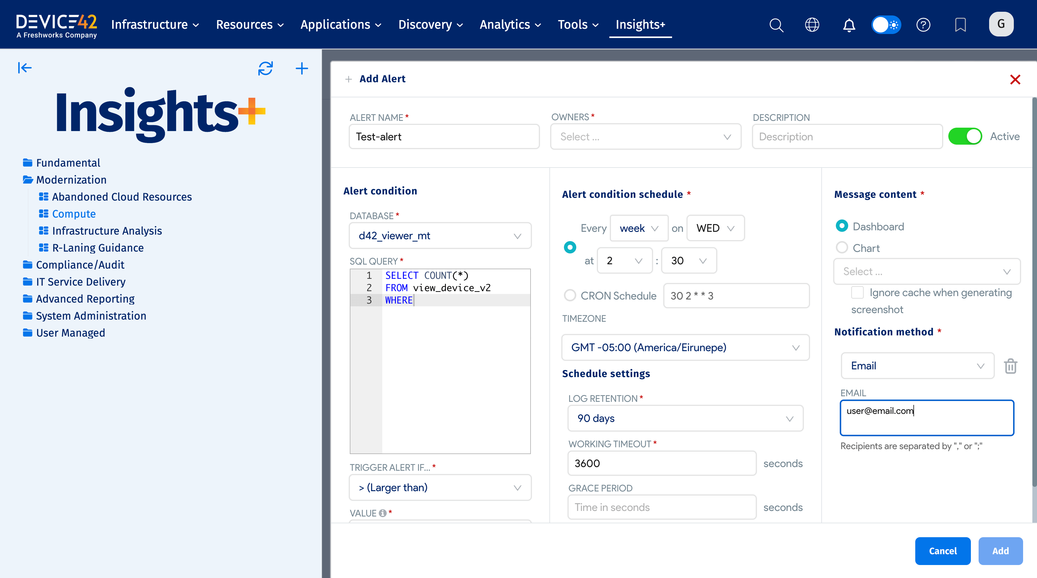
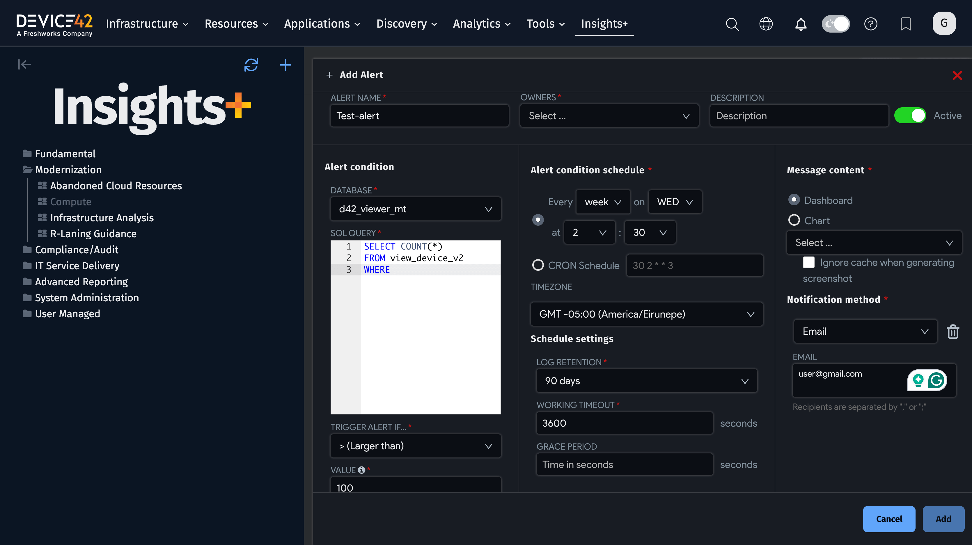
Alerts
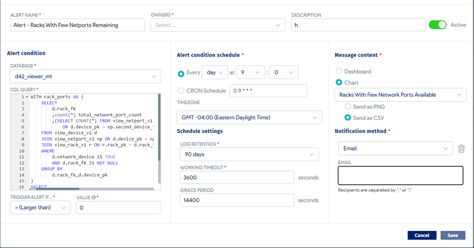
Click + Alert to add a new alert, and click the Edit icon to edit an existing alert. Insights+ displays the add/edit page. An alert lets you define an alert condition for the notification, but requires a SQL query to create the condition. The condition test is triggered according to the schedule you set for the alert.
-
Enter a Name for the alert, select the alert Owner and add a Description if you want to. Note that Owners should include the alert creator and any other users you want to be able to modify the alert.
-
The alert is Active by default.
-
Select the Database to use (this should always be
d42_viewer_mt) for the Alert condition and enter the SQL Query for the condition. Select a Trigger Alert If… operator from the dropdown, and then select the value for the statement to be used with the SQL query. -
SQL Query expects a SQL statement to poll Device42 for an aggregate value based on the input SQL. This means you'll want to use a SQL statement that has a
WHEREclause and provides the output as a single aggregate value likeCOUNT,SUM,MAX, orMIN.
Here are a few examples:
Alert on certificates expiring in 30 days:
SELECT COUNT(*) FROM view_certificate_v1
WHERE valid_to BETWEEN CURRENT_DATE AND CURRENT_DATE + 30
New device discovered without a tag:
SELECT COUNT(*) FROM view_device_v2
WHERE DATE(first_added) = CURRENT_DATE AND tags IS NULL
Device discovered over 80% local storage:
Click to expand the code block
WITH
device_capacity AS (
Select
    a.device_pk Device_ID,
    ROUND(sum(c.capacity - c.free_capacity) / sum(c.capacity) * 100,2) used_percentage
From
    view_device_v2 a
    Left Join view_mountpoint_v1 c on c.device_fk = a.device_pk
   Where c.capacity>0
               and a.network_device = 'f'
GROUP BY 1
)
SELECT COUNT(*) FROM device_capacity
WHERE used_percentage > 80
- Use the Report schedule dropdowns to set the schedule or enter a CRON Schedule.
- You can select or enter Schedule settings for Log Retention, Working Timeout, and Grace Period.
- Select either Dashboard or Chart as the Message content, and then use the dropdown to select the specific dashboard or chart you want. Select Ignore cache when generating screen shot to have Insights+ regenerate the dashboard or chart graphic rather than using a cached version.
- Select Email as the Notification method, and then enter the recipient email addresses (separated by commas or semicolons).
- Click Save to save the alert.
DCIM Dataset, Chart, and Alert Example
This section provides examples of how to take existing Device42 datasets and transform them into analytics of your own. For these datasets, you will first need to clone the dataset into one that you own and manage, so that our system dashboards are not affected by any analysis you want to do. This is most easily done by exploring the dataset and viewing it in the SQL Editor. Here, you can save it as a new dataset and label it something meaningful.
Power Flow
Power Flow is one of the datasets driving the Infrastructure Analysis dashboard, specifically the Power Usage and Impact tab. It provides valuable insight on Resource Utilization for the Power Apparent Measurement – across all metrics, windows, and time periods. To aggregate on this dataset, it is important to clearly define which singular measurement set is desired.
Since Device42 currently provides several point-in-time metrics on Power usage, you may want to develop a time-series analysis of power usage to predict future power needs. For that, a time series line chart will do well.
Start by selecting View All Charts and finding the #Time option in the list.
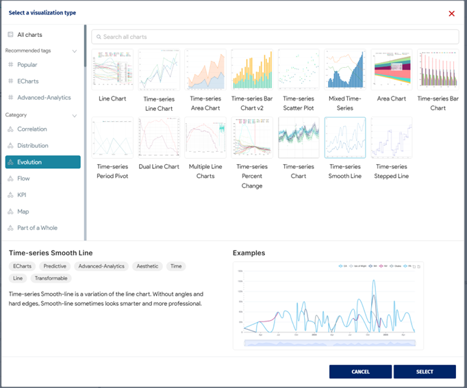
Choose the Time-series Smooth Line to return a clean looking graph. In the Time column, use Start Time from the dataset. End Time is also a suitable option depending on how you want to perform the analysis. Since it only returns day-level values, keep the Time Grain as Day.
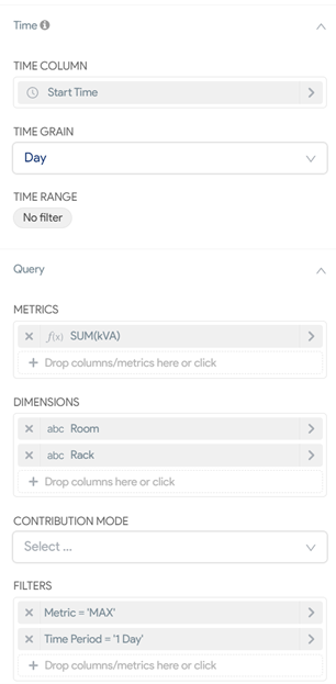
We want to measure the max power apparent from all PDUs, but let’s target the display by grouping the data by Room and Rack, so we can break down the totals into meaningful categories.
However, since the dataset returns all metrics and time periods, we need to filter down to the singular measurement we want to analyze. Let�’s use the 'MAX' metric and the '1 Day' time period to get the peak value for power apparent measured each day.
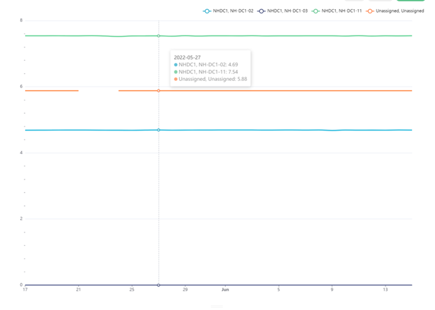
We end up with something like this, but you can choose to customize the formatting in the Customize tab, where you will find color schemes, labels, values, and other options.
Power Impact
Power Impact, which is similar to Power Flow, drives the Power Usage and Impact tab of the Infrastructure Analysis dashboard. This is a fairly simple dataset that details all dependencies related to PDUs. You can quickly build up a couple of analyses from this dataset that differ from the Device42-provided charts.
For example, you can take the cloned dataset and set up a bar chart, as in the image below.
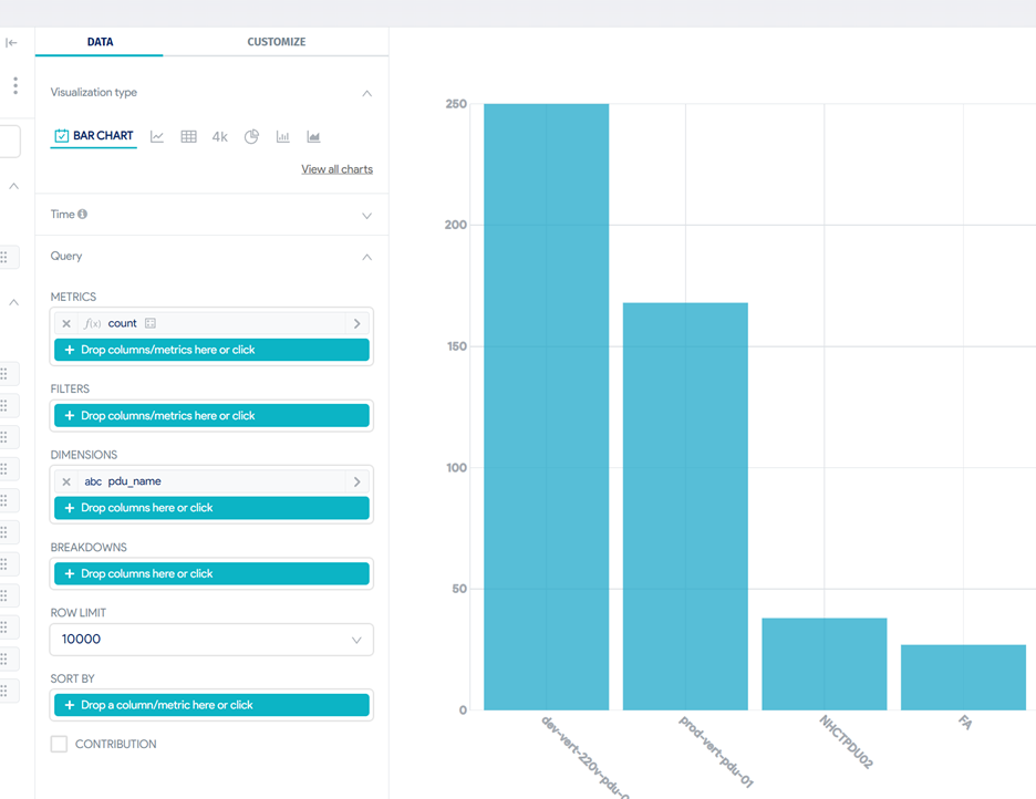
By just setting up the Dimensions as pdu and the Metrics as a count, you quickly get an idea of how ubiquitous your PDUs are across your network. You can change this to a sunburst chart to include the percentage of devices on each PDU. It is easy to add a filter to this chart to look at a particular building, room, or rack using the appropriate fields. You can swap to measure the distinct business apps affected.
This dataset is ideal for impact analysis or incident management use cases – it helps narrow down the scope of information to just the affected devices in the case of an outage.
DC Capacity – Alert Example
Data Center Capacity is a dataset that supports the Risk Center dashboard. It provides capacity information at building, room, and rack levels. Similar to power flow, we must filter down to a specific type of filter when analyzing this dataset, or the aggregation values won’t be accurate. It also makes a great example of how to use Insights+ alerts to your advantage.
First, we’ll need to create a chart that provides some immediate value. Let’s look for racks with a limited number of network ports available. We will keep it simple and just have it return some tabular data. After cloning the dataset, create a chart from it and first set up the handful of columns we think are important:
- Building
- Room
- Rack
object_tagsnetwork_device_countnetwork_port_count
In the filters, we want to display only the racks (case-sensitive) that have less than some threshold of their network ports available for use. This is done through one Simple filter and one Custom SQL filter.
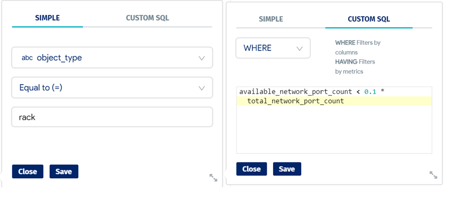
This will return a table of data showcasing racks that have less than 10% of their network ports available and it is easy to manipulate as needed. Now, let’s create both a report and an alert. A report is a scheduled execution of a chart or dashboard that can be emailed as an image or a CSV file – reports work well for tabular data, so let’s choose that option. This schedule will send the file at noon EDT once a week on Mondays, regardless of what data is returned.
An alert, while still a scheduled execution, will only send the email if a certain condition is met. In this case, let’s set up an email that will be sent every day if there are any racks that have no remaining netports available. This query was built by using the rack_port_count part of the base query we used in the chart and wrapping a COUNT around it. Alerts will sometimes require some SQL knowledge to enable intelligent conditions.
Click to expand the code block
WITH rack_ports AS (
SELECT d.rack_fk
           ,count(*) total_network_port_count
           ,(SELECT COUNT(*) FROM view_netport_v1 np WHERE d.device_pk = np.device_fk AND np.remote_netport_fk IS NOT NULL OR d.device_pk = np.second_device_fk AND np.remote_netport_fk IS NOT NULL) used_network_port_count
FROM view_device_v2 d
JOIN view_netport_v1 np ON d.device_pk = np.device_fk OR d.device_pk = np.second_device_fk
JOIN view_rack_v1 r ON r.rack_pk = d.rack_fk
WHERE
            d.network_device IS TRUE
            AND d.rack_fk IS NOT NULL
GROUP BY
            d.rack_fk,d.device_pk)
SELECT
count(DISTINCT rack_fk)
FROM rack_ports
WHERE
           total_network_port_count = used_network_port_count
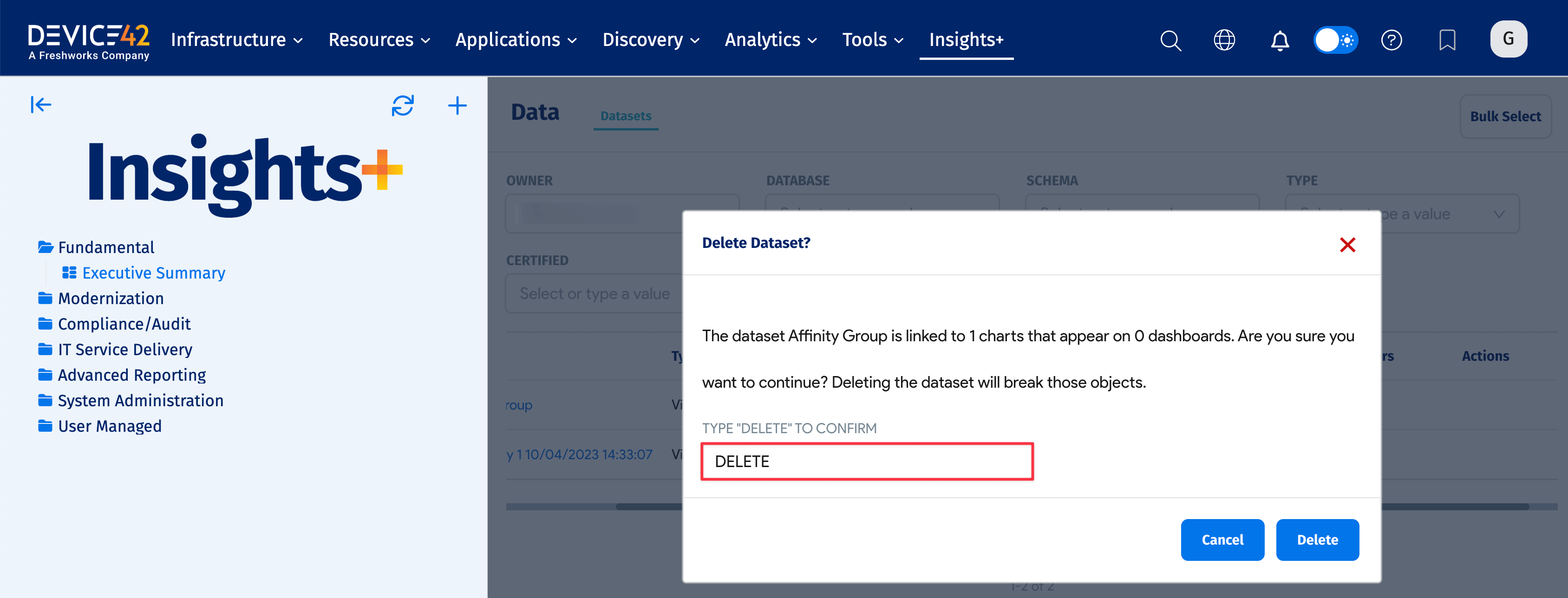
How To Delete a Custom Dataset
You can quickly delete a saved dataset by following these steps. Note that deleting a custom dataset will affect any charts and dashboards based on that dataset.
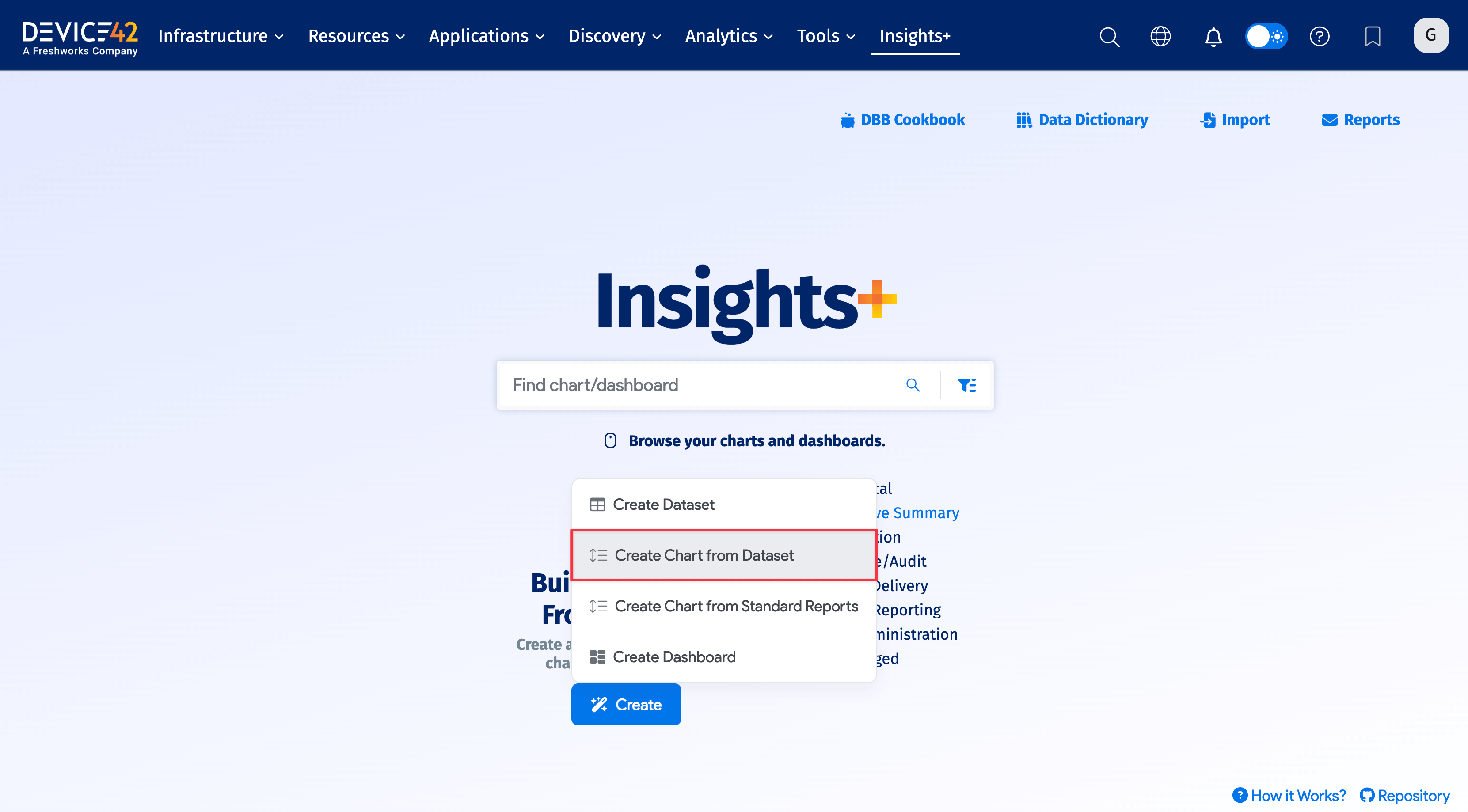
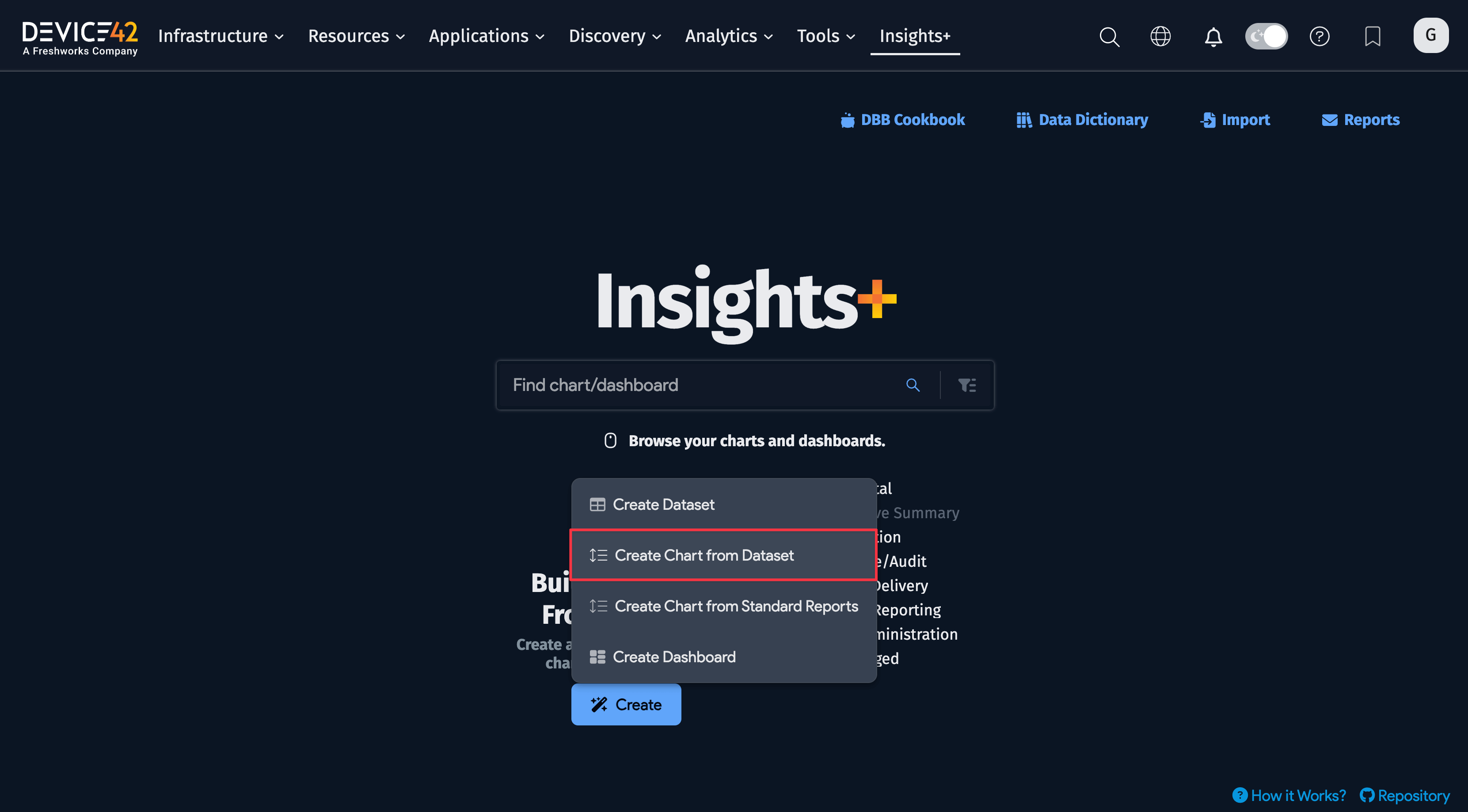
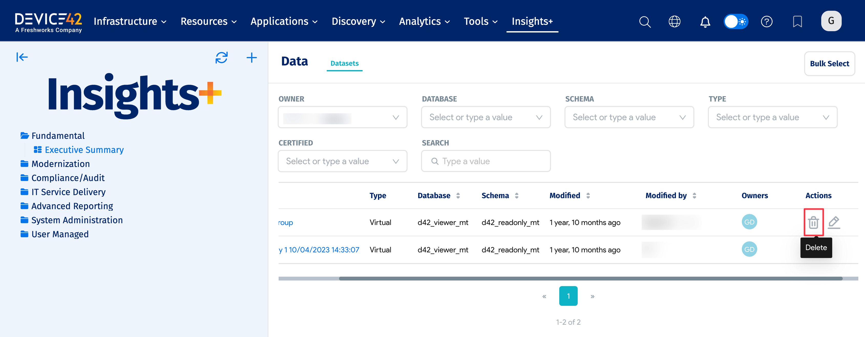
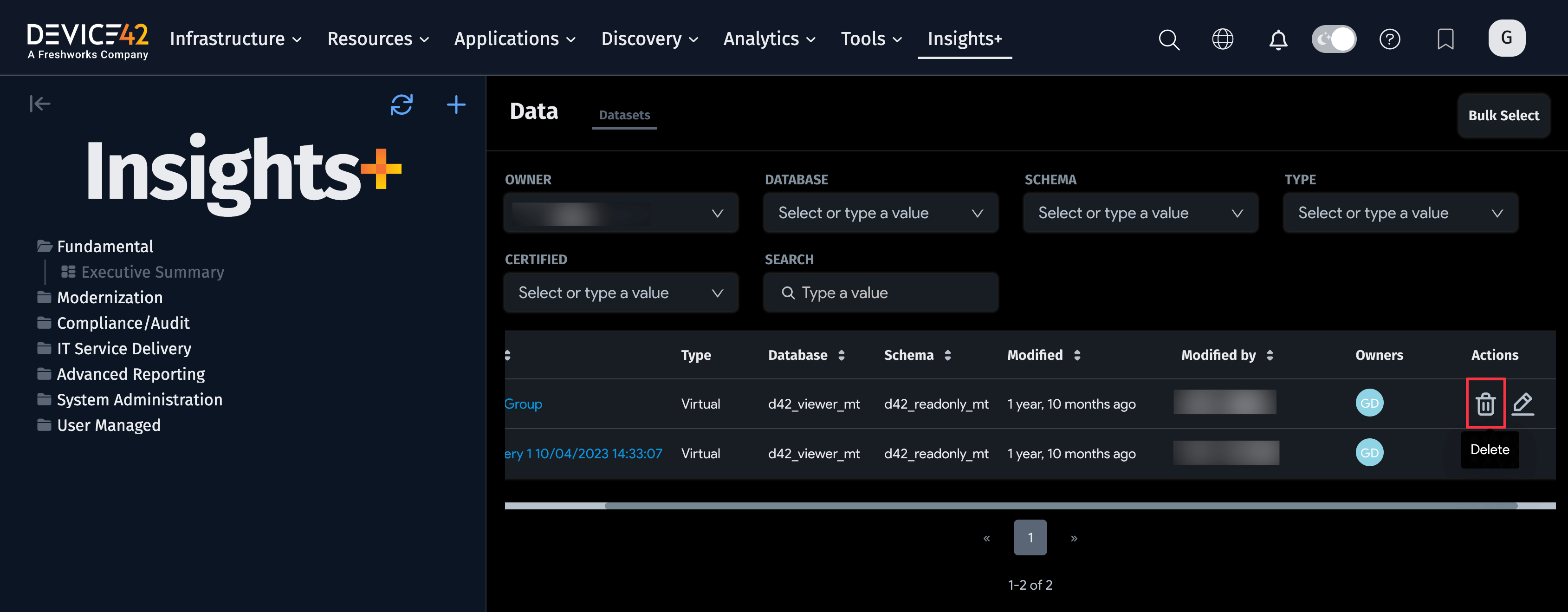
- From the Insights+ main menu, click on the Create button and select the Create Chart from Dataset option.
- You'll be directed to a table listing your existing datasets. Identify the dataset you want to delete and move your cursor to the far right, under the Actions column. A trashcan icon and pencil icon will appear as you hover over it. Click on the trashcan icon.
- A modal window will appear informing you of the number of charts and dashboards that will be affected by deleting the selected dataset. Type
DELETEinto the text box and click on the Delete button to delete the dataset.